|
Wearable devices will change the way we use and experience technology. Many challenges still need to be solved such as better integration with clothing, better battery lifetime and many questions regarding interaction. These devices can have very small displays or even no display at all. When this happens, common techniques such as keyboards and touch screens are not so useful anymore. 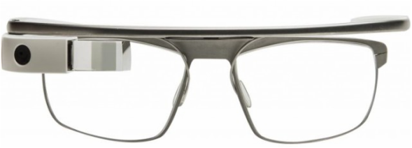 Google glass in a prescription frame. 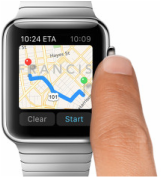 Apple Watch. Apple Watch. Today many wearables rely on a smartphone companion for internet connection and some advanced tasks, however many understand that decoupling from mobile devices is a necessary step to achieve the vision of a truly omnipresent and invisible technology. Connectivity is already on the way in devices like the Samsung S, which uses a mini-sim for direct 3G access. A good interaction technique would impact a lot the use of these devices. Apple has recognized that we need to come up with different ideas so it recently proposed using the watch crown as an interaction device. The main problem is that we usually want to increase the expressiveness of input not to narrow it. For this reason along the years we have supplemented keyboards with mouses, tablets and touch screens. By making smaller devices we inadvertently tend to scale down the interaction possibilities too. Two exceptions to this are voice and gestural input: since they are not physically attached to the input target they can maintain their power regardless of the device size. Voice recognition, unfortunately, has some obvious disadvantages if you are in a noise environment or don't want to bother nearby fellows. Together with Ayshwarya, I have been studying the possibility of developing a gesture-based text input technique as part of our work for a Natural User Interface class at Virginia Tech. We decided to go along a selection technique for letters instead of drawing/handwriting. We believe that selection has the potential of being much faster since you can create methods to choose a letter in constant time. In fact, with a few exceptions, most of the current input systems go in this way. Another trend is to use some kind of prediction or correction algorithm to minimize mistakes and effort during input. For selection, we noticed that three main actions are required: 1-Highlight a specific letter 2-Select the letter 3-Finish the word Touch based techniques implicitly highlight letters, since the user can tell from his hand position and tactile perception when no letter has been selected. Other input devices, however, may require an explicit designed disambiguation mechanism (such as a button) or use a technique that combines both highlighting and selection. Joysticks are a good example of the first group. They generally use a specific button to selected a highlighted item. On the other hand, Swype unifies the two actions: the drawing of the curve is used determine probable letters and then words. Another classic technique that combines highlighting and selection is the Dasher. In this technique the user continuously steer a cursor, which run over letters selecting them. Finally, the purpose of the last action is to enable the user to prematurely end the word input, based on suggestions from an autocomplete system. Regarding the input device, our first idea was to use Myo. This would theoretically allow users to input information using gestures and hand poses without the support of a desktop or computer, something more close to the wearable ideal. 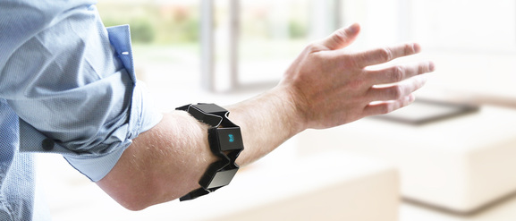 Myo, from Thalmic Labs. Myo works by analyzing signals captured from your arms in a process called electromyography. The signals are processed by a classifier that can distinguish 5 different hand poses. The armband also contains an IMU (gyroscope, accelerometer and magnetometer) that can be used to track the relative position to the ground and the acceleration of the arm.
Next steps involve generating some options for input mapping and some way of evaluating them.
0 Comments
Lets talk more about text input. What is common between the existing methods?
My first try culminated in the categorization of text input methods into four groups: 1-Physical keyboards 2-Drawing methods (grafitti, gesture for drawing) 3-Virtual keyboards (swype, virtual pointing) 4-Voice recognition This classification is far from being complete and definitive. Some techniques can combine more than one input method or can be considered borderline. For example, you can activate virtual keys by using gestures, your eye, touchscreens or hand poses. However this classification is enough to provide a start point for analysis. Keyboards are good for several reasons: you can use your 10 fingers, have a clear confirmation when the letter has been input and can use your muscle memory to type without looking at the keyboard. Drawing techniques such as Graffiti are good because they can leverage your knowledge of writing and the letter shapes to memorize a large number of commands easily. Virtual keyboards use the fact that they are not real to improve input by changing the way you activate the keys. Finally voice recognition use the association of phonemes and written text to allow you to input text. Each technique has different advantages and weakness. Graffiti may be slower than the keyboard but it is very fast to learn and can be used in constrained spaces. A good thing to do before going further is to try to establish some guidelines and principles that we can use to guide decisions later. After thinking for a while, I came up with the following dos and dont's for text input methods:
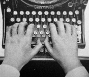
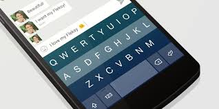
Ideally we would want something that is fast to learn and use. Something as intuitive as drawing a letter and as accurate and fast as the keyboard. When we consider the application in virtual environments, where the user does not have a physical keyboard, further restrictions apply. Many interesting ideas are ruled out from the beginning because they simply add more complexity to an existing input system. If you are selecting a letter, anything more than just pointing at it will not present a real gain. The only exception would be just looking at it instead of pointing with a device or your hand. If we want a method that is easy to learn we are pretty stuck with using a common known letter layout (qwerty or alphabetically), speech or drawing. Even with the advent of the GUI, touchscreen and voice recognition, the basic mechanism for text input remained mostly unchanged for more than 100 years. The keyboard and the QWERTY layout are still the most widely used method and still the fastest one. The qwerty layout was developed in 1868 to be used int railroad ticket typewriting. After that many changes were made in the layout to try to improve the speed, the most famous being the DVORAK. Anyway typing is quite fast. The world record is 216 words per minute, achieved on an electrical typewriter in 1968. The average typists is able to achieve 40 words per minute. Check the infographic and measure your own speed. Mobile devices, have reduced space to house a full keyboard and virtual ones also lack haptic feedback. This makes typing more challenging. To cope with this restrictions, most mobile keyboards utilize some kind of input prediction to correct words half typed or mistyped. This is an on going competition with several contenders such as swype, flesky, swiftkey and so on. The great majority, however, are still variations of the original QWERTY keyboard.
When thinking about text input in immersive environments the situation gets further complicated. Besides the lack of haptic feedback for keys there is also a loss of the reference frame. If you want to keep your hands away from a solid surface you eventually move away from the keyboard or cannot keep stroking at the same positions. I believe that a good text input method will be necessary to increase the range of applications using gestures and VR.
Researchers have come up with a lot different ideas for more natural or efficient text input in theses conditions. However, none seems to have been established as a good solution for now, which is unfortunate. For more information see: input methods  Watching computer appearances in movies is always interesting. It is fun to imagine if computer technology would really work in the way presented by Hollywood. Sometimes they manage to get computer scientists very puzzled though. Click at the image on the side to read three plausible explanations to a question whose answer has eluded many for years (Courtesy Wolf Gnards). When done right, however, movies with futuristic elements are a great opportunity to see new ideas and concepts from very skilled designers. Besides incredible motion graphics, most Sci-FI movies routinely present some kind of advanced display or interface. One recurrent ideia is the combination of holograms and 3d interaction with gestures. You can see it in several movies such as Tron, Iron Man and my favorite, District 9. These sort of motion control interfaces are well fitted for movies, but what they mean to real world designs? Leap Motion has created a nice two part video and post inspired by an analysis written by Noessel for Smashing Magazine. The video points out that even though movies seldom portray the reality, they do create expectation on the users for:
These are nice guidelines but perhaps they are too general to help us with the specific goal of building better gestural interfaces. As a user you always want to be in control, not the opposite. It is also complex to require both immersion and flow. Not all applications provide immersion and flow is hardly a property of the interface alone. In Noessel article, however, he observes that gesture in movies tend to fall into 7 different type of actions:
These actions are almost a 1:1 mapping to real world gestures. So they tend to feel more intuitive and even advanced (on the sense that they understand what you mean). This set some guidelines on what users may expect from those gestures. The most interesting point by Noessels is really about the role of language in interfaces, but I will discuss it later. If you are interested, NoteLoop has an interesting blog with a section dedicated to Movie UI.
Last year I wrote about how the Samsung's move into the smartwatch arena could be fruitful, despite the lack o appeal and technical issues with the first Galaxy Gear. Today it has officially announced its sixth smartwatch model: the Galaxy Gear S. As Engadget has pointed out, in the last 12 months the company has launched the impressive number of 5 iterations/versions of the Gear. Until now the strategy seems to be working. Samsung has been responsible for 34% of the global smartwatch sales in 2013, followed by the Peeble (NPD). This latest version seems very promising. A large screen, 3G connectivity, GPS, curved display, heart rate monitor and even a qwerty keyboard. In fact I think that it is quite cool. Relying on the same OS (Tizen) it inherits the app ecosystem from the previous generation of watches. Battery life is supposed to stay in the same range of previous ones: 2 days with similar processing power. 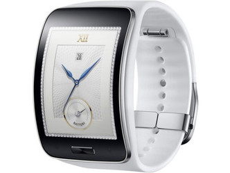 Sony has also announced its SmartWatch 3. Even though the hardware specs seem better than the Gear S, the design just feel uninteresting. Moto 360 feels much better in this respect. Update: Moto 360 has launched with a round backlit LCD, Texas Instruments OMAP 3 processor and inductive recharging dock. However, its biggest selling point is the beautiful design. The LCD circular display and stainless steel body makes the watch elegant and sophisticated. 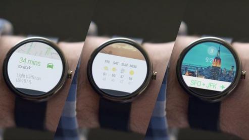 Even though the 360 has its charm, it think that being able to stay way from google, the better connectivity options and longer battery live, would make the Gear S my choice.
|
Wallace Lages
Assistant professor and entrepreneur. Archives
May 2015
Categories |
 RSS Feed